Athemaster
Data consultancy firm Athemaster is reshaping how companies achieve seamless AI integration into their operating environments - one management framework at a time. Eight years on from their inception, the brand has stood unchanged from its initial launch.
Operating with a logo and identity that could potentially be viewed as outdated was doing the company no favours. As such, they felt a revamp was necessary to shake off this perception for one that would instill trust and security in their clients.
Brand identity
Art direction
logo design
THE CHALLENGE
Athemaster excels at building robust data foundations for its clients. How do we position them as leaders of data and AI infrastructure through a robust design foundation of their own?
New life to an old bird
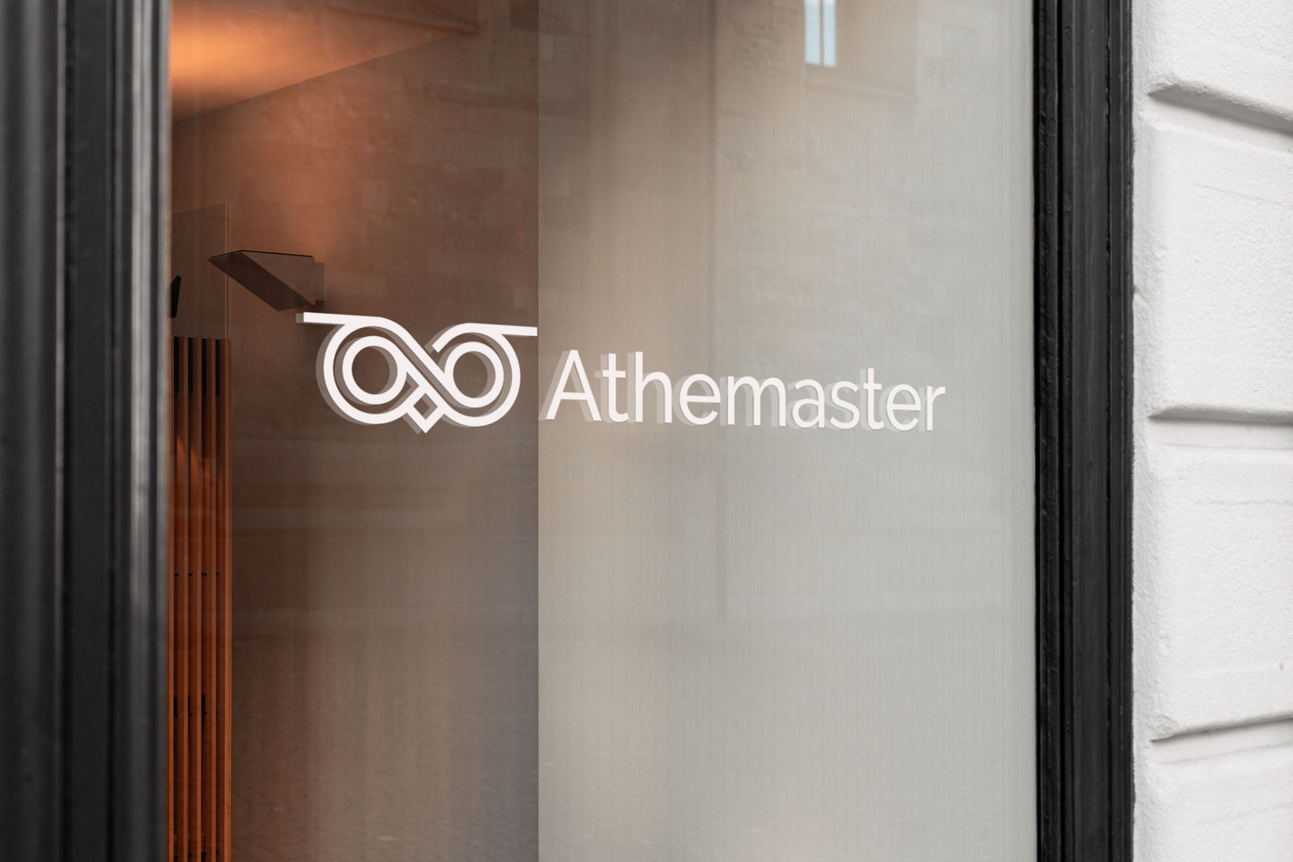
The image of the owl is a reference to the Owl of Athena, that according to myth rests on the shoulder of the Greek goddess. A symbol of knowledge and wisdom, the owl was tweaked with a more modern approach that could feel at home in the tech space. Several considerations were had including using the full body or just the face of the owl, its expression, how much detail to include. A brand having an owl for a logo was not new ground, so an added challenge was making it distinguishable among other brands with owl-centric logos. The eventual version was one that could feel sophisticated, smart and approachable without coming across as too cute or aggressive.

A positioning perched on simplicity
The visual identity was built upon Athemaster's core principles of being a beacon for wisdom and steering data forward. Being a B2B service, it was important they instill credibility and confidence in their brand voice and messaging. As such, a language was set in place that would balance tech-savvy acumen with corporate professionalism. The strategy here was to keep things simple with a concise colour palette, modest visual elements and a no-frills approach to compositions and layouts.

Athemaster
Brand identity
Athemaster is a data consultancy that uses the latest in open-source technology to provide clients with tailor-made solutions to their business problems. Emerging from the pandemic with a cooperate identity that has remained unchanged since their establishment eight years ago, they felt the time was right for a brand refresh. The goal was to achieve a more modern look that better spoke to their business offerings of being data-first.

The old logo takes inspiration from the owl of Athena, also known as Minerva, which is seen as a symbol of knowledge and wisdom throughout the Western world. With respect to its legacy and meaning, the approach was to create a simpler and more recognizable logomark that could be seen as an evolution of what came before.

A cool green hue extracted from the old logo was made the primary colour, supported by the introduction of fern green and lime. This palette was put together to evoke a response that is natural, human and professional.
Much like being a data consultant, the choice of typeface had to be smart, formal and approachable. Raleway fit the bill for its elegance and versatility. Its distinctive ligatures and terminals keeps it from getting too lost in the sea of sameness. Working well for both print and web, it equally holds it own be it for headers or body copy.

Development


